Eh... I'm feeling bored right now. My shop is about as busy as a Medieval Weapons supplier, and I just love to muck about with stuff, so I'm posting my example spritework and sigs here. Please note: these are all available for sale at my shop. Click on the link in my sig, and place in a request for the Artwork (give the piece's title, and pay in the normal fashion). So, here goes:
First set of sigs. Team Sigs to be prescise.
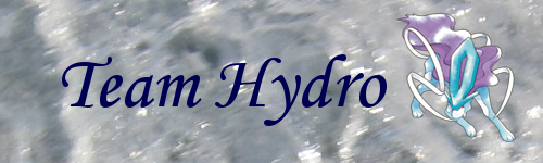
Team Hydro Sig
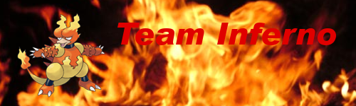
Team Inferno Sig
Team Solar Sig

Team Midnight Sig

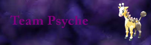
Team Psyche Sig
So criticisce, evaluate and whine if you want! I'll post more as soon as I find out how much stuff you're allowed to post in one reply.