
Forum Index • FAQ • Login
Psybucks • phpBB FAQ • Psypoke Forums FAQ • Forum Rules • Psypoke Staff


 ~
~
|
It is currently Fri Feb 07, 2025 3:30 pm |
|
All times are UTC - 8 hours [ DST ] |
My photos
Moderators: Mektar, goldenquagsire
|
|
Page 1 of 1 |
[ 8 posts ] |
| Print view | Previous topic | Next topic |
My photos
My photos
| Author | Message |
|---|---|
|
Bug Catcher   Joined: Tue Aug 15, 2006 7:33 pm Posts: 18 |
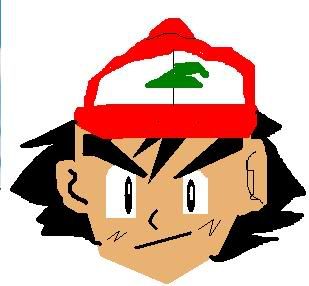
My ash
My typhlosion 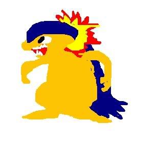
I'm only 11 ,so think about a 11 year old making that on paint! _________________     Last edited by Blastoise on Fri Sep 08, 2006 1:16 pm, edited 1 time in total. |
| Wed Sep 06, 2006 3:04 pm |
|
|
Illiterate  Joined: Mon May 08, 2006 4:18 pm Posts: 123 Location: Somewhere,earth,solar system,milky way |
That Ash is awsome!A+++
|
| Wed Sep 06, 2006 6:02 pm |
|
|
Pokemon Ranger   Joined: Sun Jun 04, 2006 7:39 pm Posts: 796 Location: San Francisco |
Why do you people save things as .jpg? At least .gif if you insist on making it horrible quality by refusing to save as a png...
What I'm trying to say is, SAVE AS A PNG. The Ash is nice, except for the graininess because its a jpg. Rather crude, but I think that it looks nice. Maybe curve the line on the hat a little bit. The Typholosion, you should work on the feet, eyes, mouth, and hands a bit. Make him slightly skinner. Personally, I don't like this one as much as ash, but that doesn't mean it's bad. _________________ [center][img]http://img293.imageshack.us/img293/766/bunnydv9.png[/img] [/center] |
| Wed Sep 06, 2006 6:14 pm |
|
|
Ace Trainer  Joined: Thu Jun 09, 2005 1:49 pm Posts: 437 Location: In the world of tomorrow! |
Ash looks pretty cool.
|
| Wed Sep 06, 2006 7:14 pm |
|
|
Psychic Trainer   Joined: Tue May 09, 2006 4:11 pm Posts: 90 Location: U.S.A |
i am gonna be honest by what i think. the ash is good but the hat needs more of a straight curve I THINK. (remember i'm saying what i think) the pokemon.. ty something i'm a horrible spelling so im not gonna try lol. anyway i think it's rly cute!! a little wider than should be but that doesnt matter i still think it's rly cute. the pictures look like the colors are starting to blend tho.... i think maybe some thin black outlining will fix that but u DONT HAVE TO LISTEN TO ME. it's ur drawing so, ya. but for doing it on the computer... it's rly rly good!! mine would probably look like blobs or color. hehe
_________________  |
| Wed Sep 06, 2006 9:23 pm |
|
|
Ace Trainer Joined: Wed Jun 07, 2006 11:20 am Posts: 274 |
im gunna be hosent like espoen girl...they both need ......:
1.Proportion.....a mini list coming up: ASh: ears are of a diferent size cap has wonkey lines you have used diferent lines in the wrong places TYPHLOSION: arms dont look like that theeth arnt curved 2. shading (makes it look 3d) 3.outline..anime stuff looks better with 1 ....i rate it */***** but its a good first atempt _________________ ERROR |
| Thu Sep 07, 2006 11:24 am |
|
|
Ace Trainer  Joined: Thu Jun 08, 2006 5:55 pm Posts: 318 Location: Connecticut. |
:O You use mspaint? I couldn't do that to save my life!
10/10. |
| Thu Sep 07, 2006 12:29 pm |
|
|
Bug Catcher Joined: Tue Aug 15, 2006 7:33 pm Posts: 18 |
Thanks from posting our opinions here!
_________________ |
| Thu Sep 07, 2006 3:43 pm |
|
|
|
Page 1 of 1 |
[ 8 posts ] |
|
All times are UTC - 8 hours [ DST ] |
Who is online |
Users browsing this forum: No registered users and 24 guests |
| You cannot post new topics in this forum You cannot reply to topics in this forum You cannot edit your posts in this forum You cannot delete your posts in this forum You cannot post attachments in this forum |