Main Site •
Psydex •
Psylab •
RBY •
GSC •
RSE •
FRLG •
DPP •
HGSS •
Chats
Forum Index • FAQ • Login
Psybucks • phpBB FAQ • Psypoke Forums FAQ • Forum Rules • Psypoke Staff
Forum Index • FAQ • Login
Psybucks • phpBB FAQ • Psypoke Forums FAQ • Forum Rules • Psypoke Staff
|
It is currently Fri Dec 20, 2024 9:34 am |
|
All times are UTC - 8 hours [ DST ] |
|
|
Page 4 of 5 |
[ 118 posts ] | Go to page Previous 1, 2, 3, 4, 5 Next |
| Print view | Previous topic | Next topic |
Skip to Pg 3 or more for art 1 and 2 are funny trolled pages
| Author | Message |
|---|---|
|
Ace Trainer  Joined: Tue Sep 16, 2008 4:51 pm Posts: 370 |
I like the typhlosion. It looks so awesome!
|
| Tue Nov 04, 2008 6:25 pm |
|
|
Ace Trainer  Joined: Tue Nov 14, 2006 5:34 pm Posts: 485 Location: Wow, this account is really embarrassing |
Hmm...some people like simplicity over complexity. Too bad for them.

That was made in 10-20 min. Enjoy _________________ 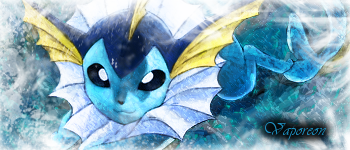 Do the Impossible. See the Invisible. Touch the Untouchable. Break the Unbreakable. |
| Wed Nov 05, 2008 9:38 pm |
|
|
Ace Trainer  Joined: Tue Sep 16, 2008 4:51 pm Posts: 370 |
I
|
| Fri Nov 07, 2008 7:50 am |
|
|
Ace Trainer  Joined: Tue Nov 14, 2006 5:34 pm Posts: 485 Location: Wow, this account is really embarrassing |
Ok, well I made this of the same method, though it didn't turn out as well as the Link one.
 _________________  Do the Impossible. See the Invisible. Touch the Untouchable. Break the Unbreakable. |
| Fri Nov 07, 2008 4:28 pm |
|
|
Ace Trainer  Joined: Tue Sep 16, 2008 4:51 pm Posts: 370 |
I think it looks cool, and is there something behind the charizard? (Sorry, I really can't tell. I think I see a head)
|
| Fri Nov 07, 2008 4:58 pm |
|
|
Ace Trainer  Joined: Tue Nov 14, 2006 5:34 pm Posts: 485 Location: Wow, this account is really embarrassing |
Umm, nothing really, just an effect I found one day out of boredom. oh, and another one, I like it better than the charizard one. Nothing beats Link though. Nothing.
 _________________  Do the Impossible. See the Invisible. Touch the Untouchable. Break the Unbreakable. |
| Fri Nov 07, 2008 5:41 pm |
|
|
Ace Trainer  Joined: Tue Sep 16, 2008 4:51 pm Posts: 370 |
Haha, I know, link is awesome.
|
| Fri Nov 07, 2008 7:37 pm |
|
|
Ace Trainer  Joined: Tue Nov 14, 2006 5:34 pm Posts: 485 Location: Wow, this account is really embarrassing |
Well...anything you want to say about it? ._.
_________________  Do the Impossible. See the Invisible. Touch the Untouchable. Break the Unbreakable. |
| Fri Nov 07, 2008 8:50 pm |
|
|
Ace Trainer  Joined: Tue Sep 16, 2008 4:51 pm Posts: 370 |
Well I like the way it looks. Did you do the blending thing again? (
|
| Sat Nov 08, 2008 10:59 am |
|
|
Ace Trainer  Joined: Tue Nov 14, 2006 5:34 pm Posts: 485 Location: Wow, this account is really embarrassing |
I did, except a different method I call Neon Displacement. If you want an explanation, I'll make one...anyway, I made some more.


And this is just Spark Displacement as a comparison  _________________  Do the Impossible. See the Invisible. Touch the Untouchable. Break the Unbreakable. |
| Sat Nov 08, 2008 2:51 pm |
|
|
Ace Trainer  Joined: Tue Sep 16, 2008 4:51 pm Posts: 370 |
My favorite is the Spark displacement deoxys. Have you ever considered making a shop in the sunnyshore market forum? You make great signatures so I was thinking maybe people would like you to make them for them, but that's just a thought.
|
| Sun Nov 09, 2008 10:46 am |
|
|
Pokemon Ranger  Joined: Wed May 30, 2007 11:57 am Posts: 863 Location: I'm stuck somewhere... Not quite sure where that is though. |
The Chimecho is the best of the neon displacements, but I don't really like the style too much. The Spark Displacement is a lot better.
I also dislike the style of the Charizard, Link, and Lucario ones. _________________ All I know is that I know nothing. |
| Sun Nov 09, 2008 8:03 pm |
|
|
Ace Trainer  Joined: Tue Nov 14, 2006 5:34 pm Posts: 485 Location: Wow, this account is really embarrassing |
Is there something wrong with Neon Displacement, because I prefer Neon Displacement myself, since it's actually a little easer in my opinion.
Also before I saw these responses, I made two other ones. My Mewtwo one makes me think it's a martian...But I myself like my Kamina (from Tengen Toppa Gurren Lagann, the best anime I've ever seen). The background looks spacial. I like that. 
 _________________  Do the Impossible. See the Invisible. Touch the Untouchable. Break the Unbreakable. |
| Mon Nov 10, 2008 5:09 pm |
|
|
Ace Trainer  Joined: Tue Nov 14, 2006 5:34 pm Posts: 485 Location: Wow, this account is really embarrassing |
...the lack of response makes me think they were bad. and I made more...but I think they look better.

 (why I chose to do a C2 banner idk) (why I chose to do a C2 banner idk)

 _________________  Do the Impossible. See the Invisible. Touch the Untouchable. Break the Unbreakable. |
| Sat Nov 15, 2008 2:18 am |
|
|
Ace Trainer  Joined: Tue Sep 16, 2008 4:51 pm Posts: 370 |
Sorry I didn't respond! I have other things to do as well. The mewtwo does look a little like a martian
|
| Sat Nov 15, 2008 12:11 pm |
|
|
Ace Trainer  Joined: Tue Nov 14, 2006 5:34 pm Posts: 485 Location: Wow, this account is really embarrassing |
good, because I made...a very random...one. and I also left two out of my last post, because I thought they weren't good enough, so those'll be shown too.


 _________________  Do the Impossible. See the Invisible. Touch the Untouchable. Break the Unbreakable. |
| Sat Nov 15, 2008 10:31 pm |
|
|
Pokemon Master  Joined: Wed Oct 03, 2007 6:17 am Posts: 1018 |
Half of this art won't show up for me, but from what I've seen, I think it's....not good. I haven't seen much, though, so don't take it the wrong way. Half the time I couldn't tell what I was looking at, especially in that Charizard one. It looked a bit like fire to me. :x
_________________  Last edited by Patchy on Mon Nov 17, 2008 12:29 am, edited 1 time in total. |
| Sun Nov 16, 2008 2:46 pm |
|
|
Ace Trainer  Joined: Tue Sep 16, 2008 4:51 pm Posts: 370 |
Really? I could tell what it was on the first time and I think his art looks awesome!
PS: I like the one in the middle and the first one is...um...well, the subject is...interesting. |
| Sun Nov 16, 2008 4:42 pm |
|
|
Dragon Tamer  Joined: Tue Sep 04, 2007 9:30 am Posts: 160 Location: ~trouble~ |
The problem with these is that they are too burned/dodged (my eyes hurt).
Also, the textures are maybe a bit too rough, and especially in the second one in your last post, repeated. You should try using softer (maybe even pastel) colours for a change, and use softer textures and brushes (some pretty fractal brushes, for example). Try having some emptier areas in your sigs (meaning there's no texture everywhere) to avoid the crowded look. Also, the render pic doesn't always need to be centered; it some situations it looks better when it's on one side of the banner. Try some other effects; almost all your banners look the same (no offense intended) and maybe make a sig without using any textures. Simple is pretty; a brush stroke here and there can be far more effective than a sig full'a grungy and rough textures. _________________  |
| Tue Nov 18, 2008 10:19 am |
|
|
Ace Trainer  Joined: Tue Nov 14, 2006 5:34 pm Posts: 485 Location: Wow, this account is really embarrassing |
Well Mewtwelve, it seems that Displacement doesn't work form me your pretty much saying. ;~;
Well, I took that advice and tried to go simple. Weeeeee  _________________  Do the Impossible. See the Invisible. Touch the Untouchable. Break the Unbreakable. |
| Tue Nov 18, 2008 9:59 pm |
|
|
Dragon Tamer  Joined: Tue Sep 04, 2007 9:30 am Posts: 160 Location: ~trouble~ |
See what I meant? That looks a lot better. :D
It's more clean and smooth now, I like that. Also, you could also try adding text. It, too, is better when it's simpler. _________________  |
| Wed Nov 19, 2008 7:00 am |
|
|
Pokemon Ranger  Joined: Wed May 30, 2007 11:57 am Posts: 863 Location: I'm stuck somewhere... Not quite sure where that is though. |
I agree, that works a lot better. It makes meh joyful..... sort of...
_________________ All I know is that I know nothing. |
| Wed Nov 19, 2008 7:45 pm |
|
|
Ace Trainer  Joined: Tue Sep 16, 2008 4:51 pm Posts: 370 |
Wow, I admit, that regigigas one looks a lot better than most of the other ones you've made. Mostly because it's a lot smoother. Some of your previous pictures look a bit sharp.
|
| Wed Nov 19, 2008 8:13 pm |
|
|
Ace Trainer  Joined: Tue Nov 14, 2006 5:34 pm Posts: 485 Location: Wow, this account is really embarrassing |
The simplicity sort of bugs me...I feel like I have to do something else to it...but w/e then. Made another anyway.
 _________________  Do the Impossible. See the Invisible. Touch the Untouchable. Break the Unbreakable. |
| Wed Nov 19, 2008 11:05 pm |
|
|
Ace Trainer  Joined: Tue Sep 16, 2008 4:51 pm Posts: 370 |
I like the way that looks and I like how you added text to this one.
|
| Thu Nov 20, 2008 8:10 am |
|
|
|
Page 4 of 5 |
[ 118 posts ] | Go to page Previous 1, 2, 3, 4, 5 Next |
|
All times are UTC - 8 hours [ DST ] |
Who is online |
Users browsing this forum: No registered users and 20 guests |
| You cannot post new topics in this forum You cannot reply to topics in this forum You cannot edit your posts in this forum You cannot delete your posts in this forum You cannot post attachments in this forum |


 ~
~